Maps
Data Analysis
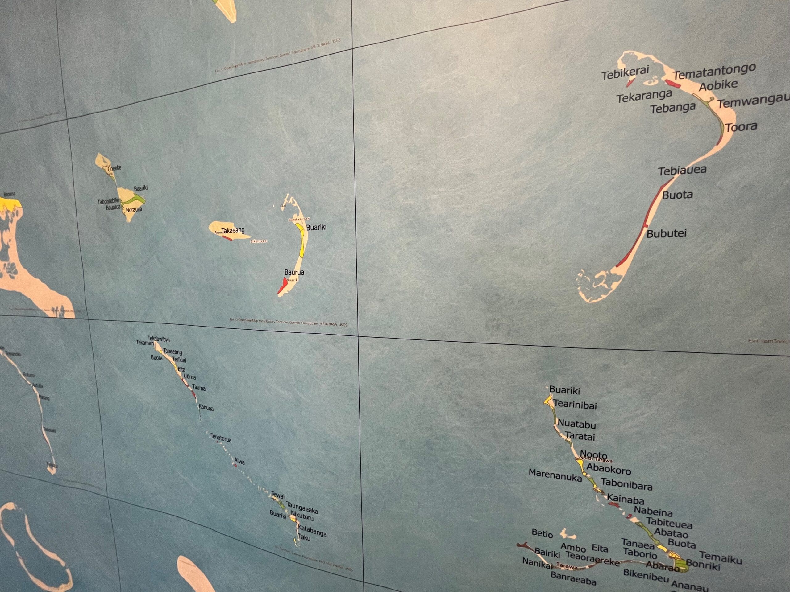
The geographic maps use a traffic light colour-coding system to indicate whether a community falls into the lower, middle, or upper tertile for each domain. Specifically, each community receives an aggregate score based on the average (mean) result of all children residing in that community. Communities are then ranked by their average score, with the top third mapped in green, the middle third in yellow, and the bottom third in red. This provides a visual representation of the relative status of children in one community compared to others.
Maps are presented for each domain of development as well as for overall development. Additionally, a map for stunting is included, where the traffic light colours are determined by the relative proportion of children in each community who meet the definition of stunting. This mapping approach offers a clear, comparative overview of developmental outcomes and child well-being across communities.
Tuvalu – 2024
Contact Us
Do you have a new version or translation of the tool, or new research and data produced from it? Submit it here for the whole community to access.